| Posted By |
Message |
Laura1976

Member since 5/05 5754 total posts
Name:
Laura
|
Dining Room - 2 colors
OUr dining room has a chair rail, so we are planning on painting one part cranberry and the other part cream. Is the darker color supposed to be on top? all the pictures we see have the dark on top, and the light on the bottom. We have dark mahogoney furniture going into the room.
|
Posted 1/10/06 11:30 AM  |
| |
|
Long Island Weddings
Long Island's Largest Bridal Resource | Prudential Douglas Elliman Real Estate |
MrsERod
Praying for Everyone.

Member since 5/05 26170 total posts
Name:
MrsERod™®
|
Re: Dining Room - 2 colors
the majority of pics that i've seen, the darker color has always been on the bottom. (the lighter color on top sometimes carries into another room. )
|
Posted 1/10/06 11:34 AM  |
| |
|
|
|
Re: Dining Room - 2 colors
This is what we did in our kitchen. I am happy with how it came out. But I think a lot depends on the space and how much light it gets, and your own taste of course.

|
Posted 1/10/06 11:38 AM  |
| |
|
skew
LIF Adult

Member since 5/05 6794 total posts
Name:
|
Re: Dining Room - 2 colors
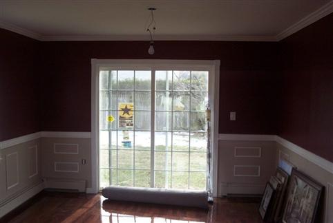
there isn't a right or wrong way but most suggest the lighter color on top to draw the eye upward. we have 3/4 wall wainscotting in the DR and painted the bottom lenox tan and the top pottery red. trim and ceiling is all timid white.
not the best pic but you get the idea Image Attachment(s):

Message edited 1/10/2006 11:45:20 AM.
|
Posted 1/10/06 11:43 AM  |
| |
|
patti08
Happy

Member since 5/05 3893 total posts
Name:
Patti
|
Re: Dining Room - 2 colors
I've been trying to work out the same thing in our dining room. I've read recently that colors should in most cases work like this. Darkest on the bottom lightest on the top. The idea being to give the eye what it knows is natural to look at. If you stand outside the dark colors are the ground, and the colors are a bit lighter as your eye moves up to trees and plants and lighter still as it moves up to the sky. I've read in a few spots that when you paint a room multiple colors with a horizonal seperation this is what you should follow.
Not that the photos posted look bad - follow your tastes, with the colors you are considering I think it would look nice either way.
|
Posted 1/10/06 2:03 PM  |
| |
|
ckdk
My girls

Member since 5/05 7027 total posts
Name:
Cheryl
|
Re: Dining Room - 2 colors
I did red on top and cream on bottom, I love the way it looks.
|
Posted 1/10/06 2:06 PM  |
| |
|
jcndd
The man of my dreams...

Member since 5/05 1706 total posts
Name:
Danielle
|
Re: Dining Room - 2 colors
I did red on top cream on bottom
Message edited 1/10/2006 5:01:27 PM.
|
Posted 1/10/06 5:00 PM  |
| |
|
CunningOne
***
Member since 5/05 26975 total posts
Name:
|
Re: Dining Room - 2 colors
We have a dark red on top, a white wainscotting on bottom.
|
Posted 1/10/06 11:01 PM  |
| |
|
chris605
.
Member since 5/05 3206 total posts
Name:
|
Re: Dining Room - 2 colors
We did the darker color on the bottom because I wanted darker curtains.... Its a preference....
|
Posted 1/10/06 11:36 PM  |
| |
|
danielleandscott
My new 71 Super Beetle

Member since 5/05 13476 total posts
Name:
Scott
|
Re: Dining Room - 2 colors
this is our dining room
Image Attachment(s):


|
Posted 1/11/06 9:18 AM  |
| |
|


